Writing · essay
A dashboard that admits what it doesn't know
A zero can mean nothing happened or that nobody looked. How I build dashboards that say what they checked and open on the people who are waiting.
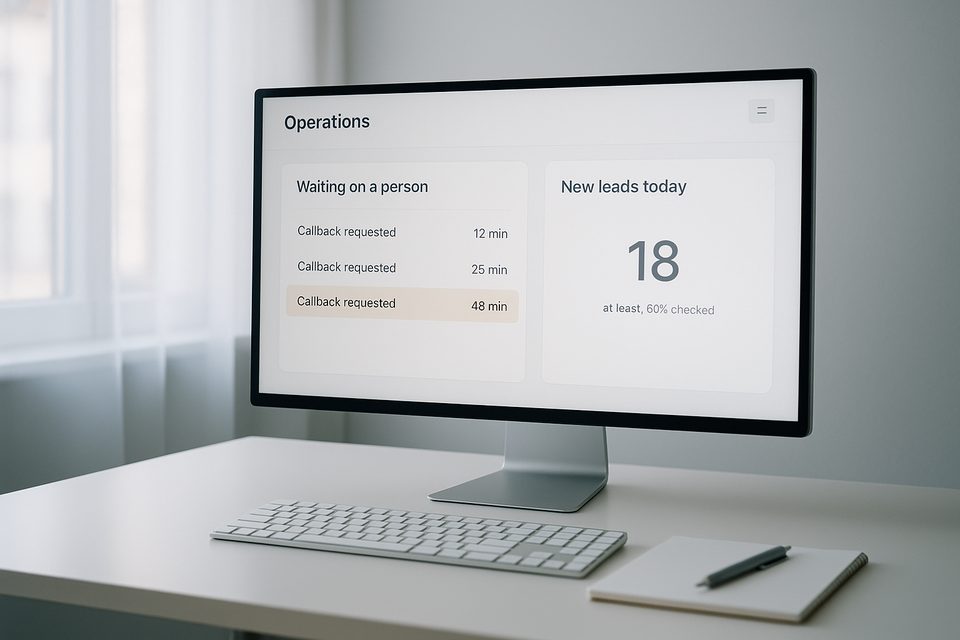
Most of my week went into designing operations dashboards for teams that work leads all day. They open it first thing in the morning and keep it open until they leave. For a screen like that, I care more about what it's honest about than how it looks.
A zero that tells you what it means
A zero can mean nothing happened. It can also mean nobody looked. On most dashboards those two look exactly the same, and they lead to very different decisions. If you can't tell which one you're looking at, you can't tell whether to relax or go check.
So every count I build shows how much of the list it actually covers and when it was last updated. If only part of the list has been checked, the number says "at least," shows how much was checked, and turns grey, so nobody mistakes it for the whole picture. If the last update time isn't known, the screen says so in plain words instead of leaving a blank.
I also add an automated test that feeds the screen a partial count on purpose and confirms the grey "at least" label shows up. People make decisions from these numbers, so I want proof built in from day one that the warning shows up when it should.
Open on the promises
The first thing on the screen is whatever is a promise to a person. That means people waiting for a callback and replies nobody has read yet. Campaign totals and trends come after that.
Each item in that first list shows how long it's been waiting and why it's there. Age is the column I look at first on any queue, because it tells you whether the team is keeping up.
Color only where someone is needed
On a screen with dozens of rows, if everything is colored, the eye has nowhere to land. So normal things are plain text, and color is saved for the few rows that need a person. The eye should land on those without searching.
The same goes for empty states. A campaign with nobody in it yet says "none yet" instead of a bare zero sitting next to a big total somewhere else on the page.
Built on a design system first
Before building screens, I set up the design system and a short screen spec. The spec says what each screen is for, and the design system keeps every screen consistent so the next one goes faster. Every screen also gets checked on a phone and for accessibility.
What leadership gets from it
A dashboard like this changes the morning conversation. Instead of arguing over whether a number is right, people talk about what to do about it. Managers can see at a glance whether anyone is waiting too long. It's the same idea behind GA4 setups that answer business questions. A screen earns its place by the decisions it supports. And when a number looks surprisingly good, it's easy to see whether it's real or just unchecked.
If you have a dashboard your team relies on, ask whoever built it what a zero means on it, and whether it would look any different if nobody had checked. That answer tells you how much weight the rest of the screen can carry.